uischema
The uischema section controls how your form looks: layout, styling, and behavior of each field. While schema defines what fields exist, uischema defines how they appear.
Required Section
Every form config must include a uischema. Without it, the fields won't render.
How It Works
UI Schema is a tree structure where you arrange your fields using layouts and controls:
- Layouts organize fields visually (vertical stacking, horizontal rows, or tabs)
- Controls connect to schema properties and render as input fields
Hierarchy Visualization
Example UIs
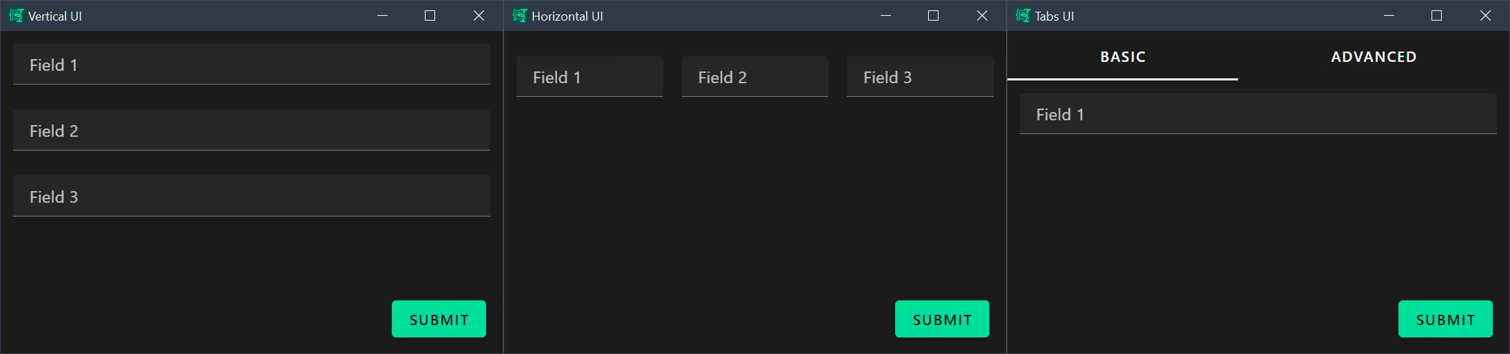 VerticalLayout (left) vs HorizontalLayout (middle) vs Categorization (right)
Root Properties
Every UI Schema starts with these properties:
| Property | Type | Required | Description |
|---|---|---|---|
type | string | Yes | Layout type: VerticalLayout, HorizontalLayout, or Categorization |
elements | array | Yes | Child layouts or controls |
label | string | No | Label text (used with Category type) |
options | object | No | Renderer configuration options |
rule | object | No | Conditional visibility rule |
Layout Types
Layouts organize how controls appear. You can nest layouts inside each other for complex arrangements.
VerticalLayout
Renders child elements vertically in a single column.
uischema:
  type: VerticalLayout
  elements:
    - type: Control
      scope: "#/properties/field1"
    - type: Control
      scope: "#/properties/field2"
HorizontalLayout
Renders child elements horizontally in a row. Commonly used for grouping related fields side-by-side.
uischema:
  type: HorizontalLayout
  elements:
    - type: Control
      scope: "#/properties/language"
      label: Language
    - type: Control
      scope: "#/properties/framework"
      label: Framework/Library
Categorization
Creates a tabbed interface where each Category becomes a separate tab.
uischema:
  type: Categorization
  elements:
    - type: Category
      label: Content
      elements:
        - type: VerticalLayout
          elements:
            # controls...
    - type: Category
      label: Style
      elements:
        - type: VerticalLayout
          elements:
            # controls...
Control Elements
Control elements bind schema properties to input components. They are leaf nodes in the UI Schema tree.
Control Properties
| Property | Type | Required | Description |
|---|---|---|---|
type | string | Yes | Must be "Control" |
scope | string | Yes | JSON pointer to schema property (e.g., "#/properties/fieldName") |
label | string | No | Display label for the field (overrides schema title) |
options | object | No | Control-specific configuration |
rule | object | No | Conditional visibility rule |
Scope Syntax
The scope property uses JSON Pointer syntax to reference schema properties:
| Scope Pattern | References |
|---|---|
"#/properties/name" | Top-level property name |
"#/properties/user/properties/email" | Nested property user.email |
"#/properties/items/items" | Array items schema |
Options System
The options object on controls and layouts provides fine-grained configuration. Options are passed to the JSON Forms renderer and can control both JSON Forms behavior and Vuetify component properties.
Common JSON Forms Options
| Option | Type | Applies To | Description |
|---|---|---|---|
format | string | Control | Input format: "radio", "select", "date", "time", "date-time" |
multi | boolean | Control | Enable multiline input (renders as VTextarea instead of VTextField) |
dateFormat | string | Control (date) | Display format for date pickers (e.g., "DD.MM.YYYY") |
dateSaveFormat | string | Control (date) | Format for saving date values (e.g., "YYYY-MM-DD") |
Format Option
The format option customizes how certain fields are rendered, for example:
# Radio buttons (enum field)
- type: Control
  scope: "#/properties/priority"
  options:
    format: radio

# Dropdown select (enum field)
- type: Control
  scope: "#/properties/language"
  options:
    format: select

# Multiline textarea
- type: Control
  scope: "#/properties/description"
  options:
    multi: true

# Date picker with custom formats
- type: Control
  scope: "#/properties/mydate"
  options:
    dateFormat: DD.MM.YYYY
    dateSaveFormat: YYYY-MM-DD
Vuetify Option
The vuetify option allows direct configuration of underlying Vuetify components. This provides access to the full Vuetify component API.
Vuetify Options Structure
options:
  vuetify:
    v-component-name:
      propertyName: value
      anotherProperty: value
The component name corresponds to the Vuetify component being rendered (e.g., v-text-field, v-select, v-radio-group).
Component Mapping
| Schema Type | Format | Default Component | Vuetify Option Key |
|---|---|---|---|
string | - | VTextField | v-text-field |
string | multi: true | VTextarea | v-textarea |
string (enum) | radio | VRadioGroup | v-radio-group |
string (enum) | select | VAutocomplete | v-autocomplete |
string (enum) | - | VSelect | v-select |
string | date | Custom Date Control | v-text-field (wrapped) |
boolean | - | VCheckbox | v-checkbox |
array | - | Custom Array Control | Various |
Common Vuetify Properties
# Radio group configuration
options:
  format: radio
  vuetify:
    v-radio-group:
      inline: true        # Display radios horizontally
      hideDetails: true   # Hide validation messages

# Textarea configuration
options:
  multi: true
  vuetify:
    v-textarea:
      rows: 10           # Initial row count
      autoGrow: true     # Expand automatically

# Select/Autocomplete configuration
options:
  format: select
  vuetify:
    v-autocomplete:
      hideDetails: true
      clearable: true

# Text field configuration
options:
  vuetify:
    v-text-field:
      density: compact
      hideDetails: auto
Rules and Conditional Visibility
Rules control when elements are visible or enabled based on values of other form fields. The rule system uses JSON Schema for condition matching. There's a dedicated Conditional Visibility guide for more details.
Rule Structure
- type: Control
  scope: "#/properties/errorMessage"
  rule:
    effect: SHOW     # or HIDE, ENABLE, DISABLE
    condition:
      scope: "#/properties/taskType"
      schema:
        enum:
          - debug
          - fix
Rule Properties
| Property | Type | Required | Description |
|---|---|---|---|
effect | string | Yes | Action to take: SHOW, HIDE, ENABLE, DISABLE |
condition | object | Yes | Condition specification |
condition.scope | string | Yes | JSON pointer to property to check |
condition.schema | object | Yes | JSON Schema that property value must match |
Rule Effects
| Effect | Description |
|---|---|
SHOW | Show element when condition is true, hide otherwise |
HIDE | Hide element when condition is true, show otherwise |
ENABLE | Enable element when condition is true, disable otherwise |
DISABLE | Disable element when condition is true, enable otherwise |
Condition Schemas
condition.schema uses standard JSON Schema syntax:
# Show if field equals specific value
condition:
  scope: "#/properties/type"
  schema:
    const: "email"

# Show if field is one of multiple values
condition:
  scope: "#/properties/taskType"
  schema:
    enum:
      - debug
      - fix
      - test

# Show if boolean is true
condition:
  scope: "#/properties/advanced"
  schema:
    const: true

# Show if number is in range
condition:
  scope: "#/properties/priority"
  schema:
    minimum: 7
    maximum: 10
Complete UI Schema Examples
Basic Vertical Layout
uischema:
  type: VerticalLayout
  elements:
    - type: Control
      scope: "#/properties/subject"
      label: Subject
      options:
        multi: false
    - type: Control
      scope: "#/properties/priority"
      label: Priority
      options:
        format: radio
    - type: Control
      scope: "#/properties/contact_name"
      label: Contact Name
Categorized Form with Tabs
uischema:
  type: Categorization
  elements:
    - type: Category
      label: Content
      elements:
        - type: VerticalLayout
          elements:
            - type: Control
              scope: "#/properties/type"
              label: Help me reply to this
              options:
                format: radio
                vuetify:
                  v-radio-group:
                    inline: true
                    hideDetails: true
            - type: Control
              scope: "#/properties/content"
              options:
                multi: true
    - type: Category
      label: Style
      elements:
        - type: Control
          scope: "#/properties/style"
          label: Style guidelines
Horizontal Field Groups
uischema:
  type: VerticalLayout
  elements:
    - type: HorizontalLayout
      options:
        vuetify:
          v-col:
            padding: 0
      elements:
        - type: Control
          scope: "#/properties/language"
          label: Language
          options:
            format: select
            vuetify:
              v-autocomplete:
                hideDetails: true
        - type: Control
          scope: "#/properties/framework"
          label: Framework/Library
          options:
            format: select
            vuetify:
              v-autocomplete:
                hideDetails: true
Date Control with Custom Formatting
uischema:
  type: VerticalLayout
  elements:
    - type: Control
      scope: "#/properties/mydate"
      label: Select Date
      options:
        dateFormat: DD.MM.YYYY
        dateSaveFormat: YYYY-MM-DD
Best Practices
Label Configuration
Labels can be defined in three places (in order of precedence):
- UI Schema
labelproperty (highest priority) - Schema
titleproperty - Property name (if no title/label provided)
# Schema defines title
schema:
  properties:
    email:
      type: string
      title: Email Address  # Used if no UI Schema label

# UI Schema overrides
uischema:
  - type: Control
    scope: "#/properties/email"
    label: Your Email    # Takes precedence over schema title
Layout Organization
- Use
Categorizationfor forms with multiple logical sections (3+ sections) - Use
VerticalLayoutfor simple forms or within categories - Use
HorizontalLayoutsparingly for related fields (e.g., first/last name, language/framework) - Nest layouts no more than 3-4 levels deep for maintainability
Vuetify Options
- Set
rowsproperty onVTextareafor expected content size - Use
hideDetails: trueon inputs where validation messages are not critical to reduce visual clutter - Use
inline: trueonVRadioGroupfor horizontal radio button layouts - Use
clearable: trueon select/autocomplete fields to allow easy clearing of selections - Use
autoGrow: trueon textareas to expand with content