Form Layouts
Layouts organize how controls are arranged on the form. You can nest layouts inside each other to create complex arrangements.
Layout Types
| Layout | Description |
|---|---|
VerticalLayout | Stack elements top to bottom |
HorizontalLayout | Arrange elements side by side |
Categorization | Tabbed interface |
Category | A single tab (used inside Categorization) |
VerticalLayout
Stacks child elements vertically in a single column. This is the most common layout.
uischema:
  type: VerticalLayout
  elements:
    - type: Control
      scope: "#/properties/firstName"
    - type: Control
      scope: "#/properties/lastName"
    - type: Control
      scope: "#/properties/email"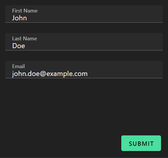
HorizontalLayout
Arranges child elements side by side in a row. Useful for related fields like first/last name or city/state/zip.
uischema:
  type: HorizontalLayout
  elements:
    - type: Control
      scope: "#/properties/firstName"
    - type: Control
      scope: "#/properties/lastName"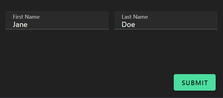
Controlling Column Spacing
Use Vuetify options to control spacing:
uischema:
  type: HorizontalLayout
  options:
    vuetify:
      v-col:
        padding: 0
  elements:
    - type: Control
      scope: "#/properties/field1"
    - type: Control
      scope: "#/properties/field2"
Nesting Layouts
Combine layouts for complex forms. A common pattern is horizontal rows inside a vertical layout:
uischema:
  type: VerticalLayout
  elements:
    # Row 1: First and Last Name side by side
    - type: HorizontalLayout
      elements:
        - type: Control
          scope: "#/properties/firstName"
        - type: Control
          scope: "#/properties/lastName"

    # Row 2: Email (full width)
    - type: Control
      scope: "#/properties/email"

    # Row 3: City, State, Zip side by side
    - type: HorizontalLayout
      elements:
        - type: Control
          scope: "#/properties/city"
        - type: Control
          scope: "#/properties/state"
        - type: Control
          scope: "#/properties/zip"
Categorization (Tabs)
Creates a tabbed interface. Each tab is a Category element.
uischema:
  type: Categorization
  elements:
    - type: Category
      label: Personal Info
      elements:
        - type: VerticalLayout
          elements:
            - type: Control
              scope: "#/properties/name"
            - type: Control
              scope: "#/properties/email"

    - type: Category
      label: Preferences
      elements:
        - type: VerticalLayout
          elements:
            - type: Control
              scope: "#/properties/theme"
            - type: Control
              scope: "#/properties/notifications"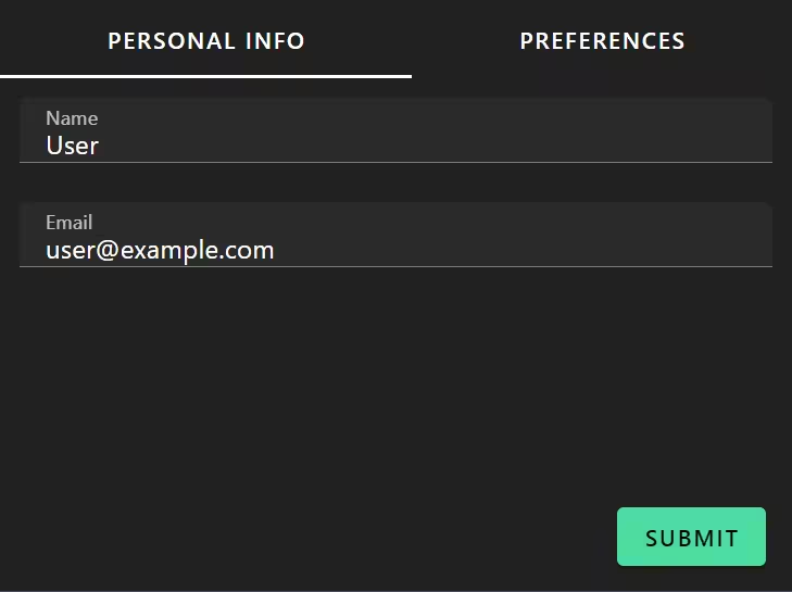
Category Structure
Each Category must have:
type: Categorylabel— Tab titleelements— Content (usually starts with a layout)
- type: Category
  label: Tab Title
  elements:
    - type: VerticalLayout
      elements:
        # Controls go here
Always wrap category content
It's best practice to wrap Category contents in a VerticalLayout for consistent spacing.
Complete Examples
Simple Vertical Form
schema:
  type: object
  properties:
    name:
      type: string
    email:
      type: string
    message:
      type: string

uischema:
  type: VerticalLayout
  elements:
    - type: Control
      scope: "#/properties/name"
      label: Name
    - type: Control
      scope: "#/properties/email"
      label: Email
    - type: Control
      scope: "#/properties/message"
      label: Message
      options:
        multi: true
Form with Field Groups
schema:
  type: object
  properties:
    firstName:
      type: string
    lastName:
      type: string
    email:
      type: string
    phone:
      type: string
    addressLine1:
      type: string
    city:
      type: string
    state:
      type: string
    zip:
      type: string

uischema:
  type: VerticalLayout
  elements:
    # Name row
    - type: HorizontalLayout
      elements:
        - type: Control
          scope: "#/properties/firstName"
          label: First Name
        - type: Control
          scope: "#/properties/lastName"
          label: Last Name

    # Contact row
    - type: HorizontalLayout
      elements:
        - type: Control
          scope: "#/properties/email"
          label: Email
        - type: Control
          scope: "#/properties/phone"
          label: Phone

    # Address
    - type: Control
      scope: "#/properties/addressLine1"
      label: Address

    # City/State/Zip row
    - type: HorizontalLayout
      elements:
        - type: Control
          scope: "#/properties/city"
          label: City
        - type: Control
          scope: "#/properties/state"
          label: State
        - type: Control
          scope: "#/properties/zip"
          label: ZIP
Three-Tab Form
uischema:
  type: Categorization
  elements:
    - type: Category
      label: Basic Info
      elements:
        - type: VerticalLayout
          elements:
            - type: Control
              scope: "#/properties/name"
            - type: Control
              scope: "#/properties/email"

    - type: Category
      label: Details
      elements:
        - type: VerticalLayout
          elements:
            - type: Control
              scope: "#/properties/description"
              options:
                multi: true
            - type: Control
              scope: "#/properties/priority"

    - type: Category
      label: Attachments
      elements:
        - type: VerticalLayout
          elements:
            - type: Control
              scope: "#/properties/files"
Labels
You can add static text labels that don't connect to data:
- type: Label
  text: "Section Title"
Useful for adding instructions or section headers within a form.
Conditional Layout Visibility
Apply rules to show/hide entire layout sections:
- type: VerticalLayout
  rule:
    effect: SHOW
    condition:
      scope: "#/properties/showAdvanced"
      schema:
        const: true
  elements:
    - type: Control
      scope: "#/properties/advancedOption1"
    - type: Control
      scope: "#/properties/advancedOption2"
See Conditional Visibility for more on rules.
Best Practices
- Use VerticalLayout as root — It provides best default spacing
- Wrap Category contents in VerticalLayout — For consistent padding
- Group related fields horizontally — Name parts, address components
- Keep tab count reasonable — 2-5 tabs is ideal
- Use descriptive tab labels — Short but clear (e.g., "Contact", not "Step 2")