Bubble Activation Triggers
Bubble activation triggers determine how and when Definer's popup bubble appears.
You can customize these triggers to match your preferred workflow.
Triggers
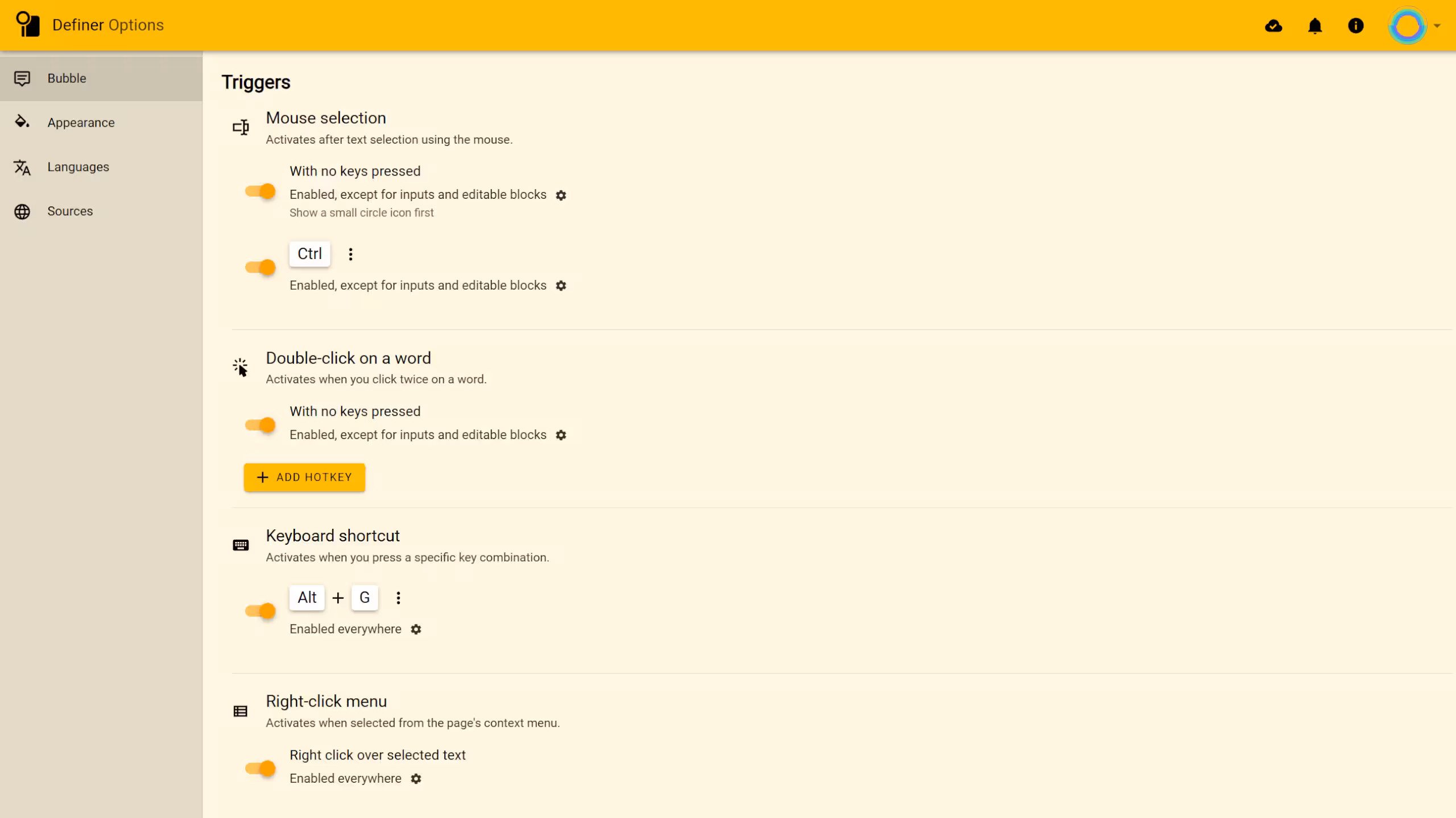
Definer offers four main ways to activate the popup bubble. You can toggle each trigger on or off, and customize their hotkeys and activation rules.
Mouse Selection
Activates after selecting text with the mouse.
With No Keys Pressed
Simply select text with your mouse without pressing any keys on your keyboard. By default, this trigger is enabled with the "Circle icon" option, meaning a small clickable icon appears next to your selection first. Click this icon to display the full bubble.
With a Hotkey
Select text while holding down a designated key (default is "Ctrl"). The bubble appears automatically when you release the mouse button.
Double-Click on a Word
Activates when you quickly click twice on a word.
You can also double-click and drag to select multiple words in sequence.
With No Keys Pressed
Simply double-click any word. This trigger is enabled by default.
With a Hotkey
Double-click a word while pressing a designated key.
Keyboard Shortcut
Activates when you press a specific key combination after selecting text. By default, this trigger uses "Alt + G" and works everywhere, including in text fields and editable areas.
Right-Click Menu
Activates when you right-click on selected text and choose "Define [text]" from the context menu. This trigger is enabled by default in all contexts, including text fields and editable areas.
Trigger Activation Rules
Each trigger can have additional rules that determine where and how it functions.
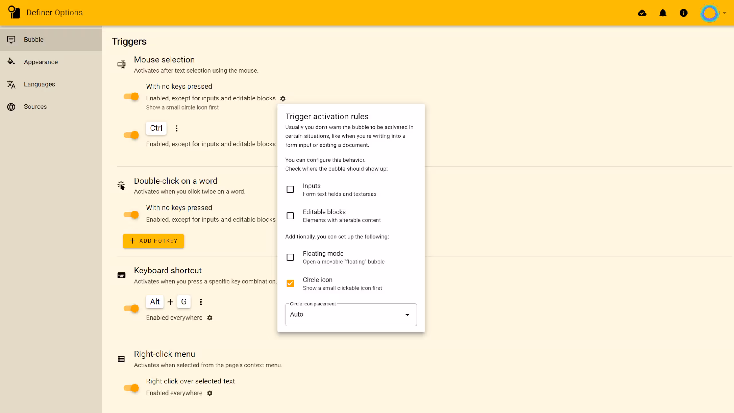
Inputs
Controls whether triggers work in form text fields and textareas. By default, most triggers are disabled in these areas to avoid interfering with your typing.
Editable Blocks
Controls whether triggers work in elements with editable content. Like with inputs, most triggers are disabled here by default.
Floating Mode
When enabled, opens a movable "floating" bubble that you can position anywhere on your screen.
Circle Icon
When enabled, shows a small clickable icon first instead of immediately displaying the full bubble. This helps prevent unwanted popups while still keeping the feature easily accessible.
Placement
You can decide exactly where your circle icon appears:
- Auto: It'll automatically find its spot, usually at the bottom center relative to your selected text.
- Next to the mouse pointer: It will pop up near your cursor when you finish selecting text. Ideal if you'd rather not search for it afterward.