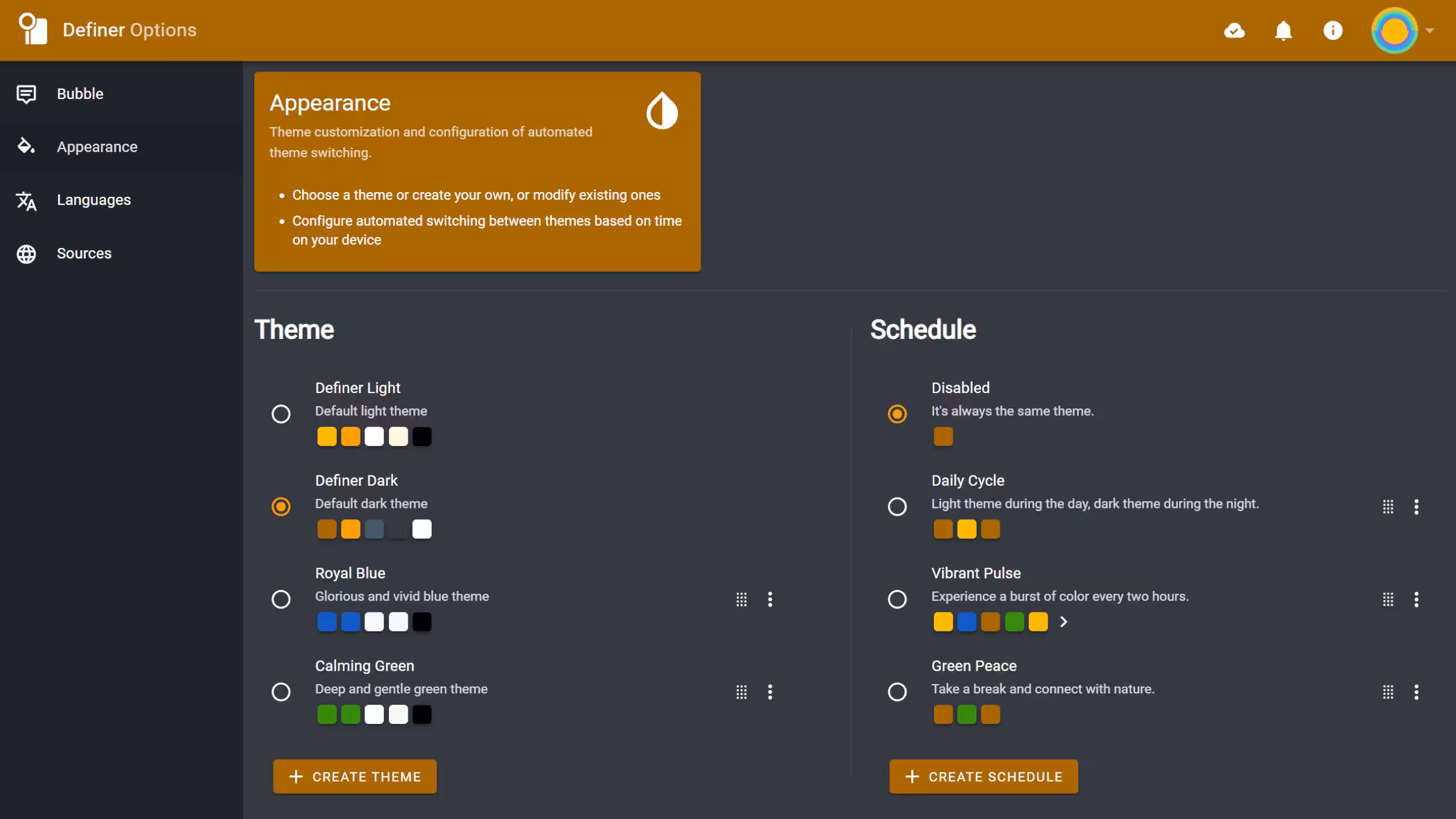
Themes
Definer's appearance is fully customizable through themes. You can choose from default options, create your own designs with the built-in editor, or even set up automatic theme switching based on the time of day using schedules.
Default Themes
Definer comes with four carefully designed themes to suit different preferences:
- Definer Light: A clean and bright theme for a fresh look.
- Definer Dark: A sleek and modern dark theme for low-light environments.
- Royal Blue: A vibrant blue theme for a touch of elegance.
- Calming Green: A soothing green theme for a relaxed experience.
 Definer's default themes
Definer Light and Definer Dark are special persistent themes that cannot be edited, deleted, or reordered. However, if you want to make minor adjustments, you can create a new theme based on either in two steps:
- Activate the theme you want to customize
- Click the "CREATE THEME" button
Custom Themes
You can create your own themes using the built-in editor.
Royal Blue and Calming Green are technically custom themes (meaning you can edit, delete, or reorder them), but they come included by default.
Creating a Theme
To create a new theme:
- Navigate to the Appearance page in Definer Options
- Click the CREATE THEME button
- Use the theme editor to customize colors, fonts, and styles
Managing Existing Themes
Click the three-dot menu (⋮) next to any theme to:
- Edit: Modify colors, fonts, and styles
- Delete: Remove the theme
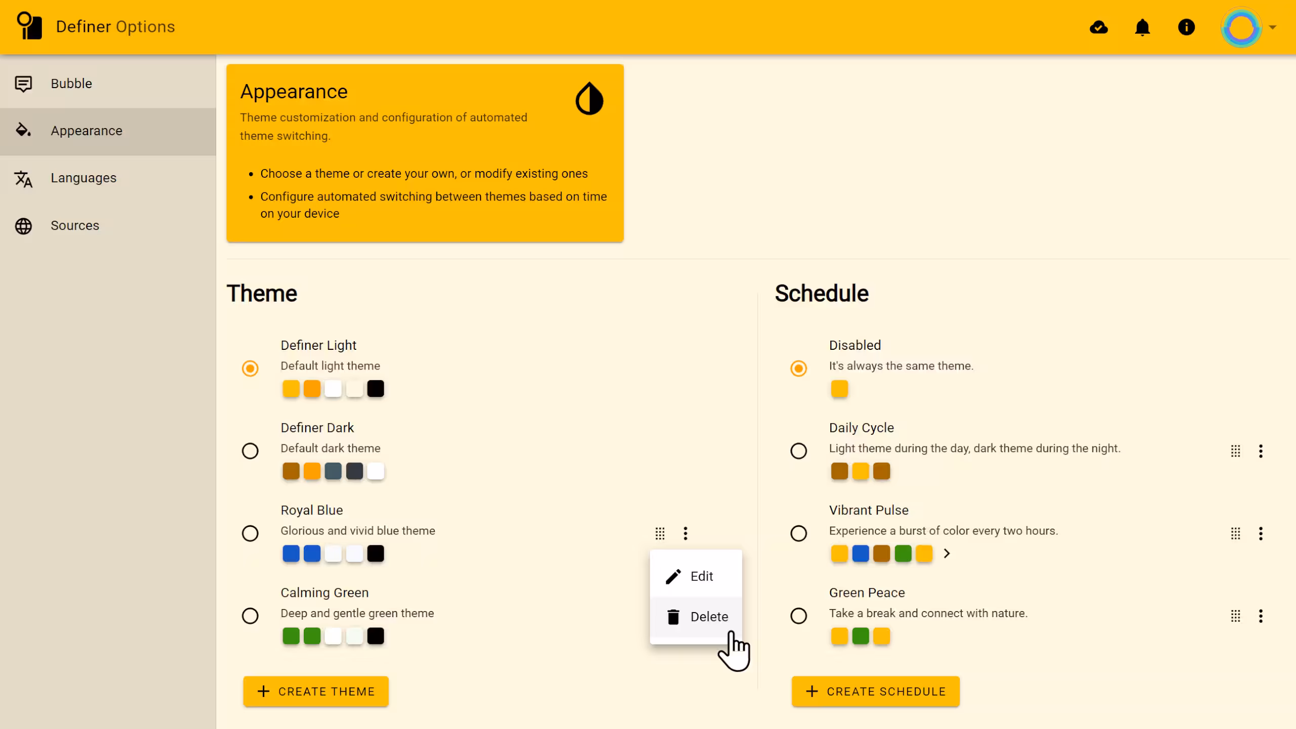 Theme actions menu
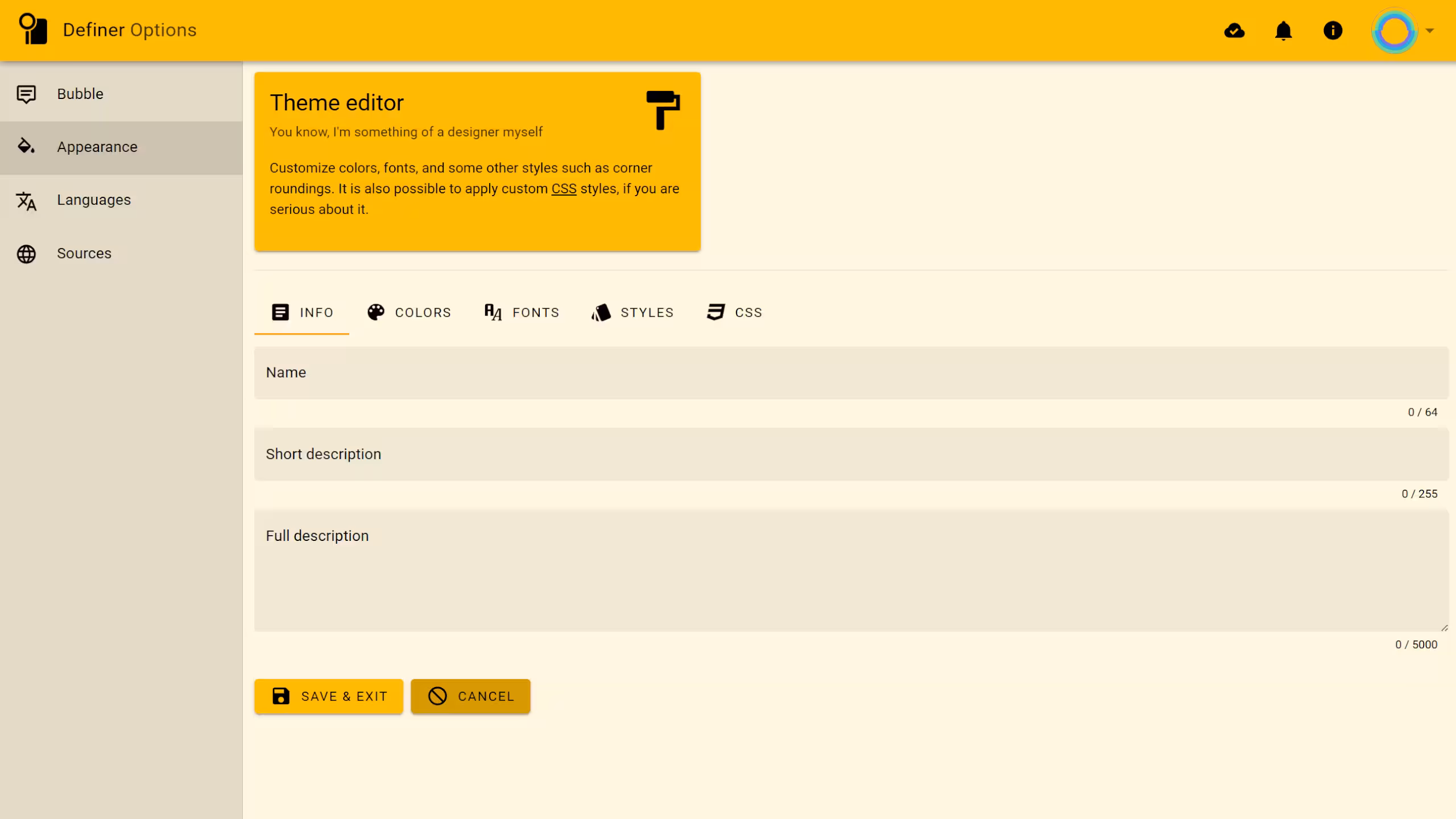
Theme Editor
The theme editor gives you complete control over your custom themes with several customization categories.
Info
Set the basic details of your theme:
- Name - What you'll call your masterpiece
- Short description - A brief summary
- Full description - A detailed explanation
 Definer's theme editor - Info tab
Colors
Definer uses a consistent color palette across all its features, including Definer Options, Popup Bubble, Extension Window, and even PDF Reader.
Customize these colors to create your perfect visual experience:
- Primary - The main color for buttons, toolbars, and key elements
- Secondary - For interactive cards and elements (should contrast with background)
- Accent - For highlights and emphasis
- Background - The most abundant color in the interface
- Primary text - A variant of the primary color used specifically for text
- Text - The main text color (should be legible on both secondary and background colors)
- Contrast text - Text color that remains readable on elements using the primary color as background
- Links - For hyperlinks and clickable text
- Success - For those satisfying "everything worked!" messages
- Warnings - For "proceed with caution" notifications
- Errors - For "oops, something went wrong" alerts
- Info - For neutral informational messages
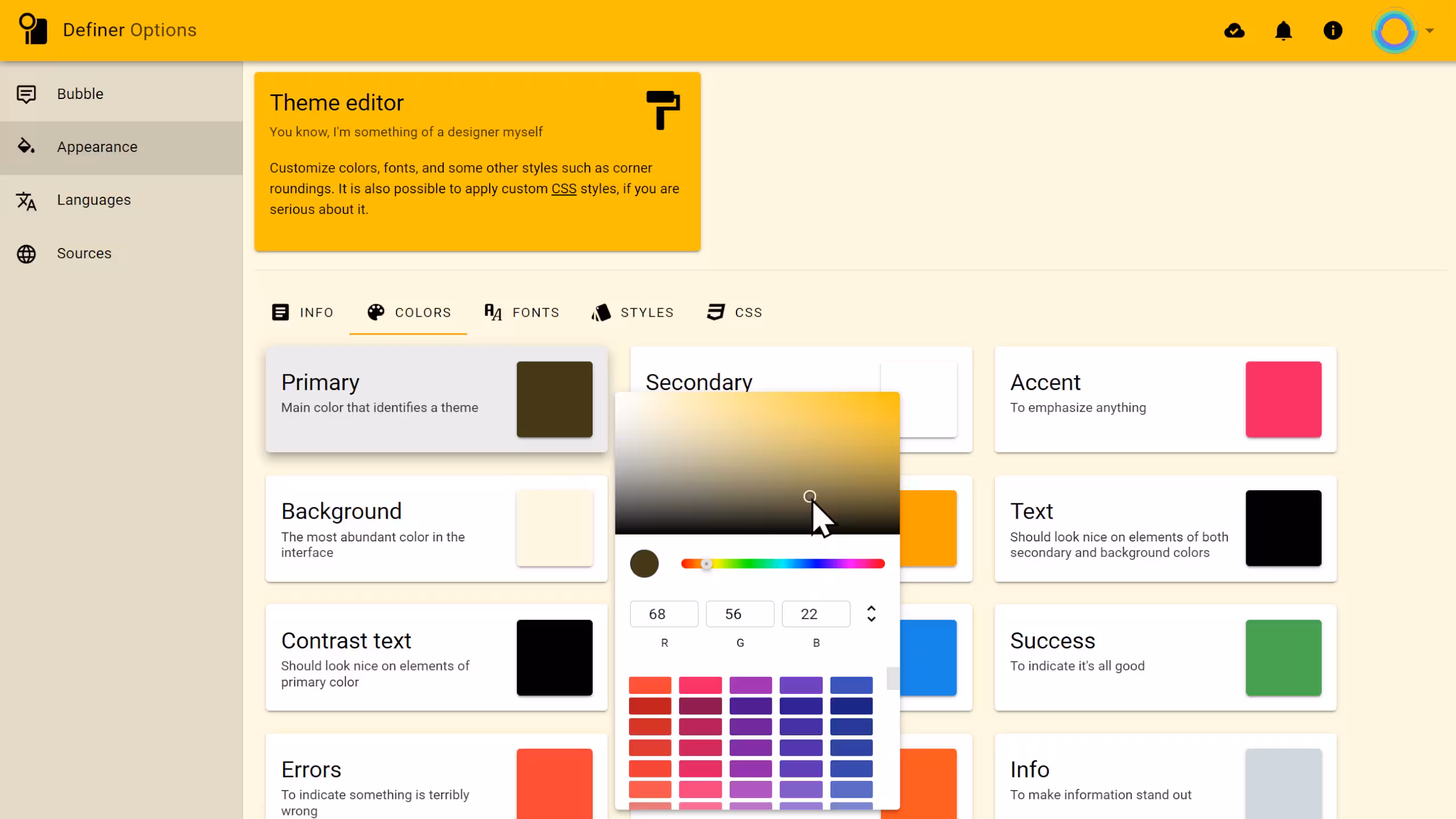 Definer's theme editor - Colors tab
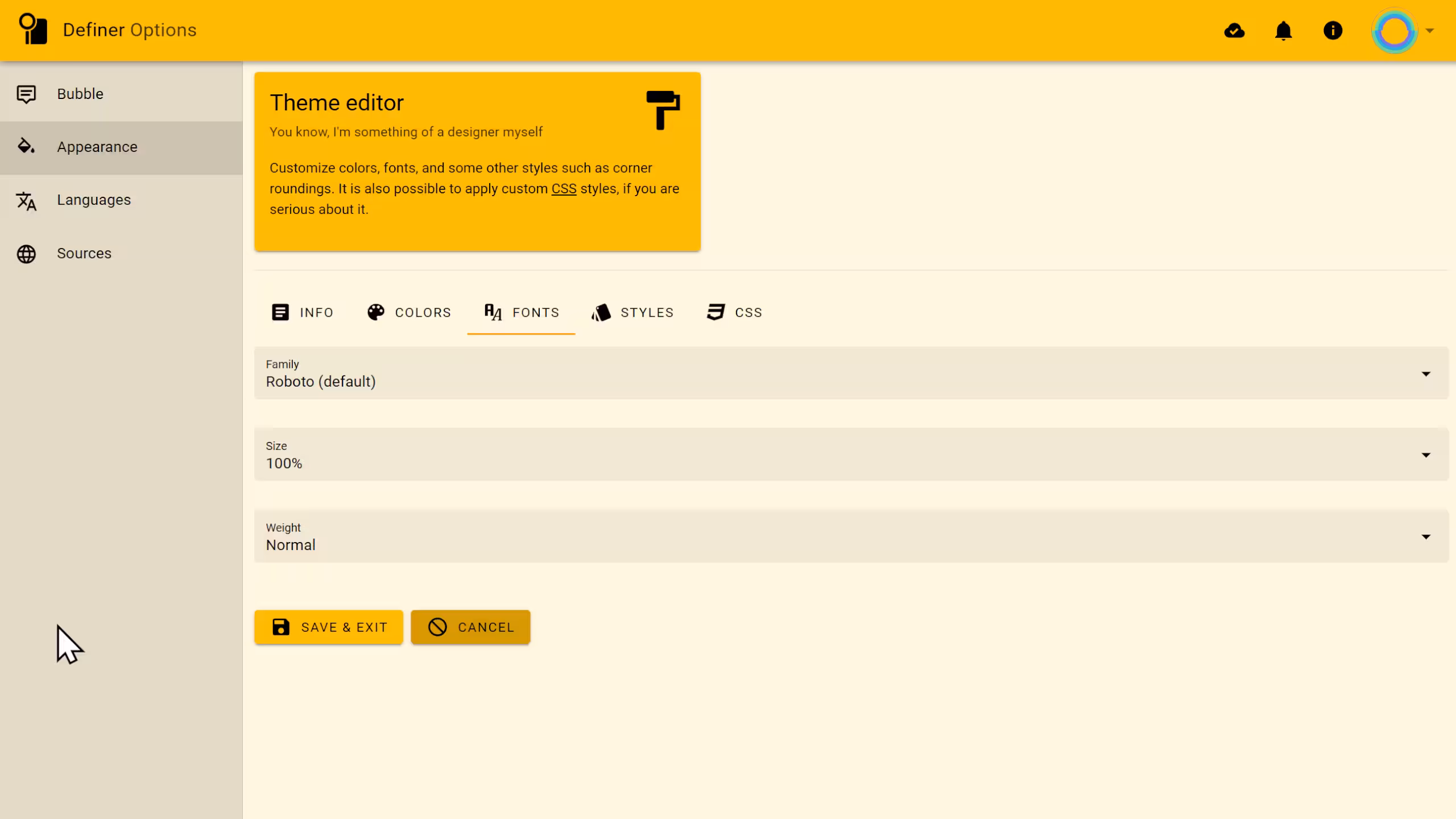
Fonts
Fonts are a crucial part of your theme, affecting readability and overall aesthetics.
You can customize the following font properties:
Family
Definer uses Roboto by default, but you can choose from these alternatives:
- Arial
- Times New Roman
- Helvetica
- Times
- Verdana
- Geneva
- Calibri
- Optima
- Didot
- Monaco
- Brush Script MT
- Lucida Bright
- Copperplate
- Garamond
- Courier New
- Monospaced
NOTE
The font must be installed on your system to display properly.
Size
Adjust font size from 10% to 200% relative to the default (100% = 16px). Perfect for those who squint at small text or those blessed with eagle vision.
Weight
Choose how bold your text appears:
- Thicc - For making a statement
- Normal - The Goldilocks option
- Thin - For a more delicate look
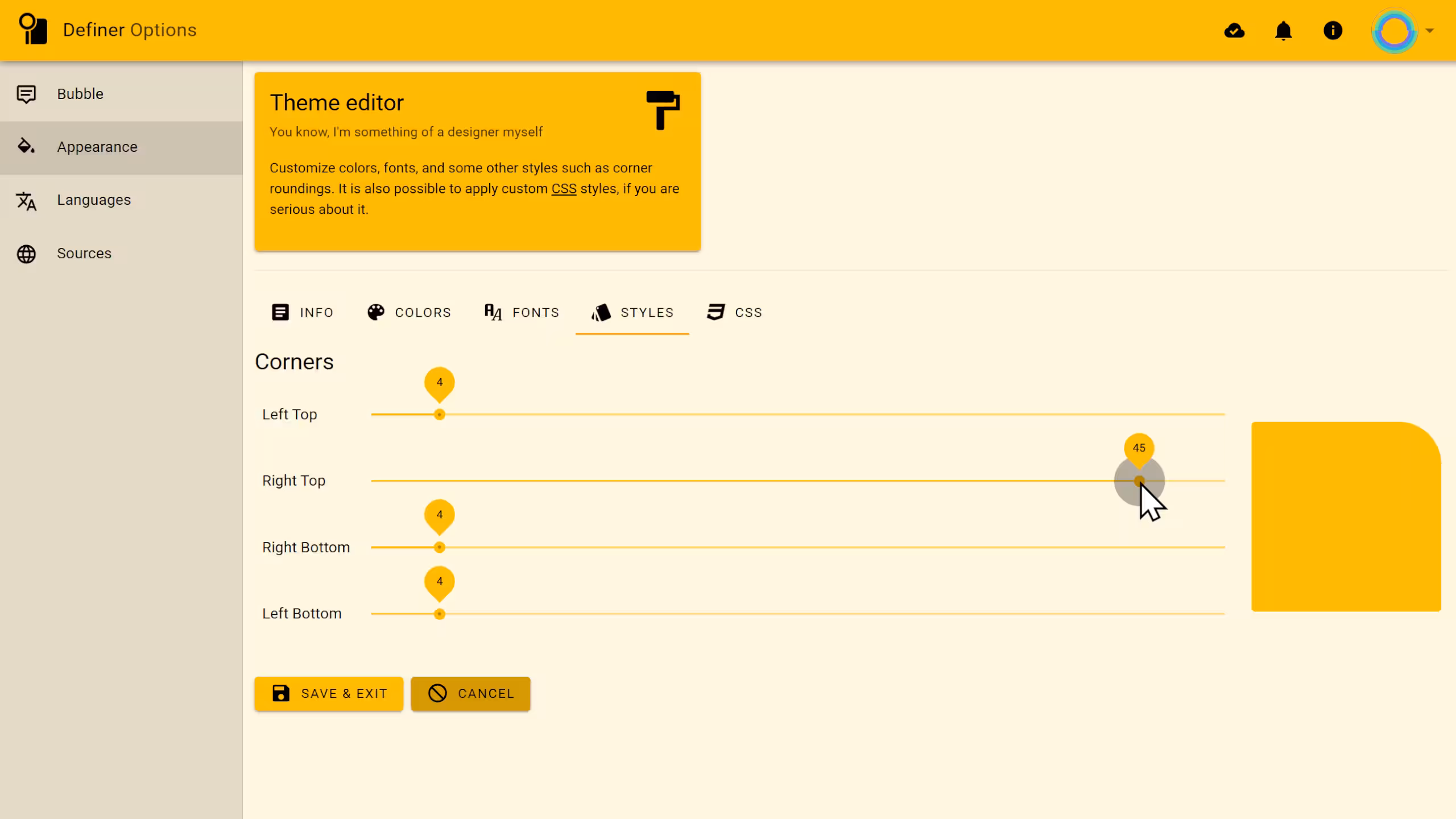
Styles
Styles are used to customize the appearance of various elements in Definer.
Corners
Control the roundness of elements like buttons, cards, and the Popup Bubble.
Adjust each corner independently:
- Left Top
- Right Top
- Right Bottom
- Left Bottom
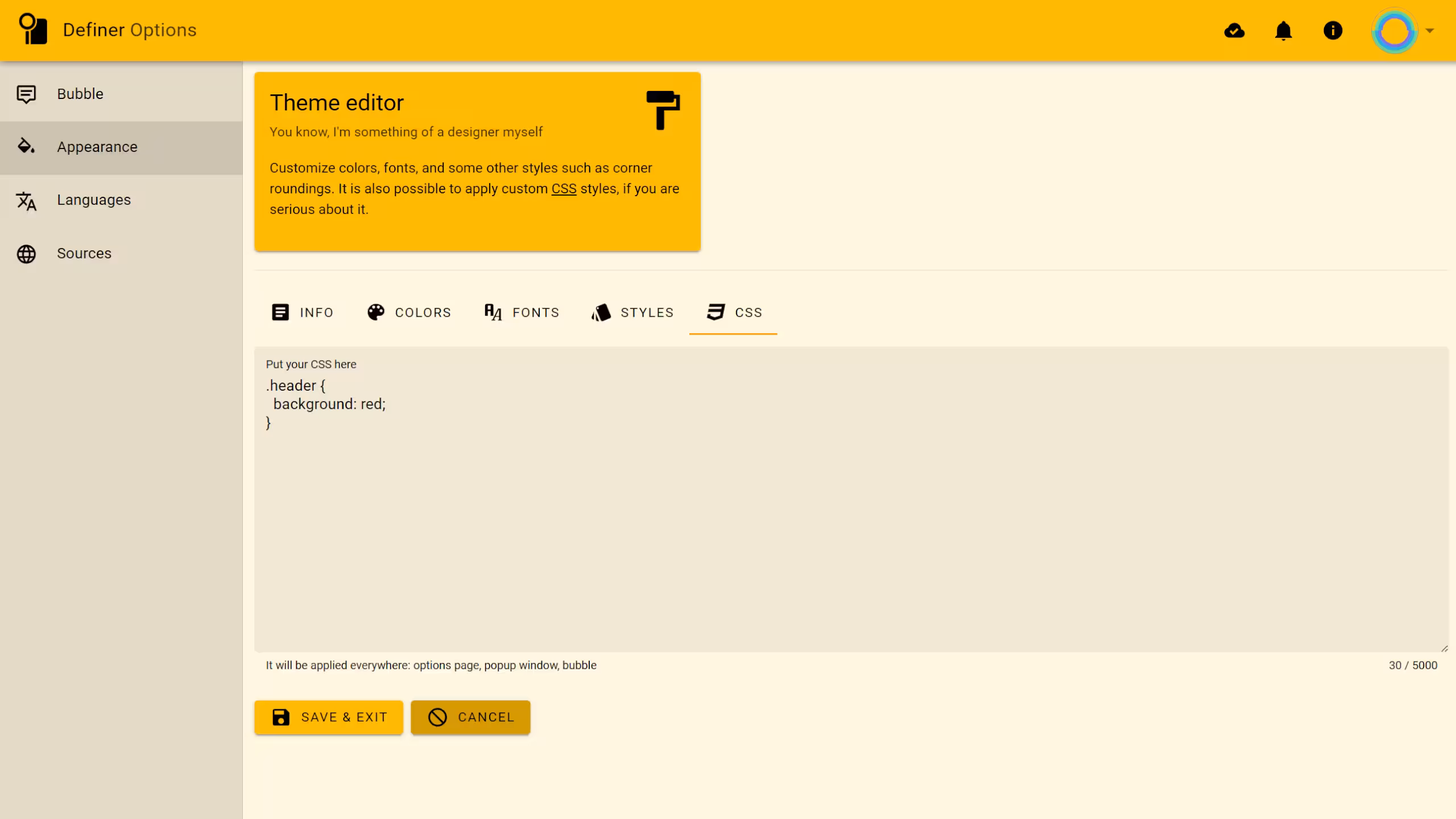
CSS
For the power users and design enthusiasts, add custom CSS to take your theme beyond the built-in options. Your CSS will apply to all extension pages including Definer Options, the Extension Window, and the Popup Bubble.