CSS Customization
Definer is built with web technologies, so it uses HTML and CSS for its interface, just like any website. This gives you a lot of flexibility to customize how everything looks using CSS.
You can modify Definer's interface itself or style the third-party websites that appear inside the popup bubble.
What is CSS?
CSS (Cascading Style Sheets) is a language that controls how web pages look. It lets you change colors, fonts, spacing, and layout. If you're new to CSS, check out the CSS on MDN Web Docs.
Where to Add Custom CSS
You can add CSS in two places, depending on what you want to customize.
Theme CSS (Global)
Theme CSS applies to the entire extension, including Definer Options, the Extension Window, and the Popup Bubble.
To add theme CSS:
- Open Definer Options → Appearance
- Click Create Theme or edit an existing theme
- Go to the Custom CSS tab
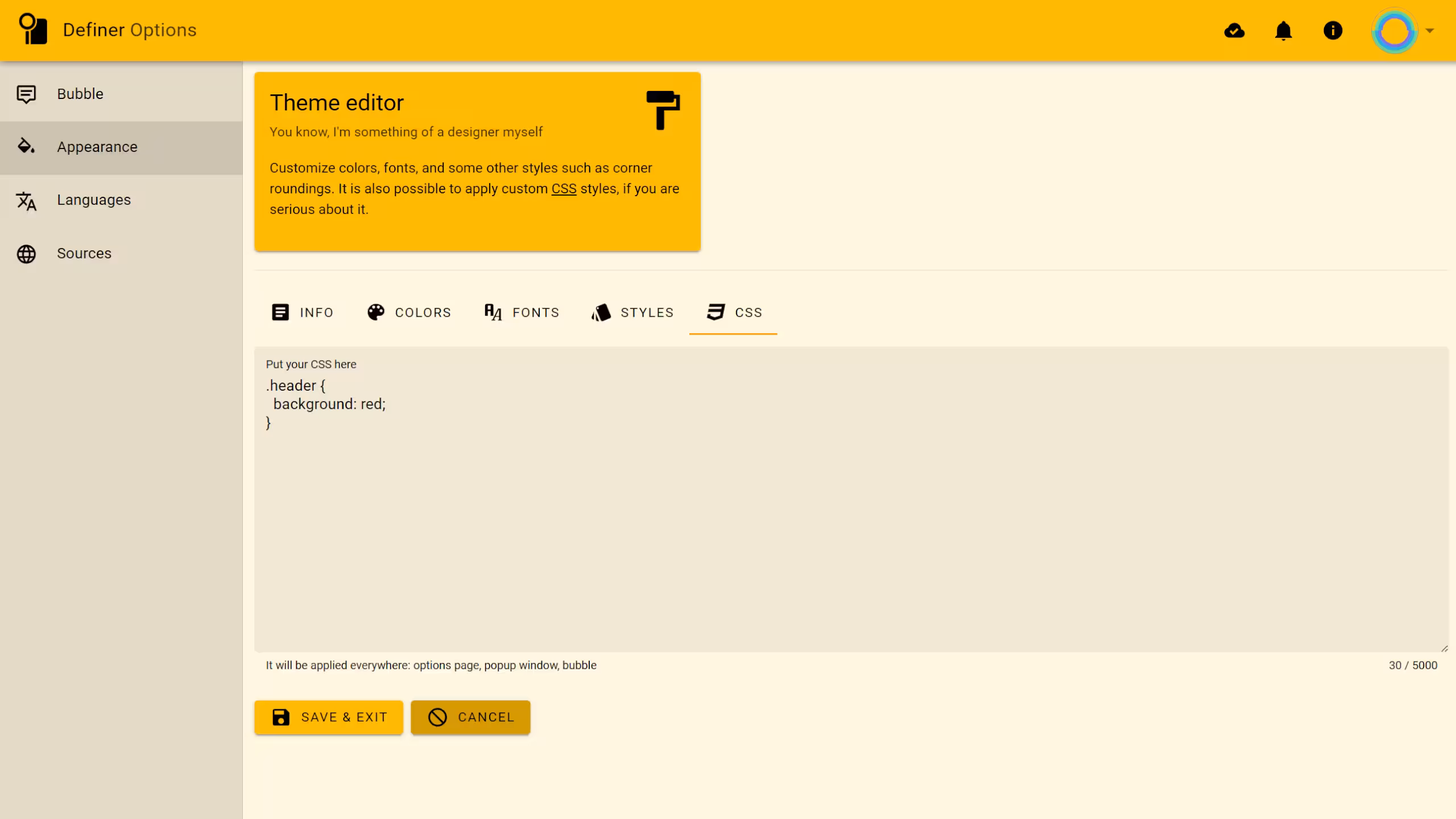 Definer's theme editor - Custom CSS tab
Targeting Specific Pages
If you only want your styles to apply to certain parts of Definer, use these selectors:
/* Options page only */
.definer-options {
  /* your styles */
}

/* Extension window only */
.definer-popup {
  /* your styles */
}

/* On-page bubble only */
.definer-bubble {
  /* your styles */
}
Source CSS (Per-Source)
Source CSS only applies when that specific source is displayed. This is perfect for styling third-party websites that load inside Definer's popup.
Sources that support custom CSS include Custom, Google Search, and Wikipedia.
To add source CSS:
- Open Definer Options → Sources
- Open the settings of the source you want to customize
- Find the CSS field
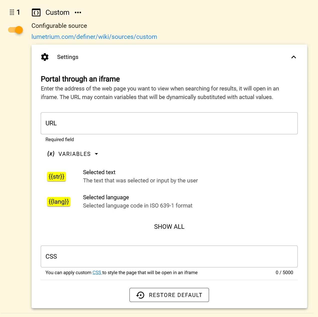 Source settings with the CSS field
Common uses for source CSS:
- Hide ads, headers, footers, and cookie banners
- Match the website's colors to your Definer theme
- Optimize layout for the limited popup space
- Fix readability issues on dark or light themes
Using Developer Tools
Before writing CSS, you'll need to find the right selectors for the elements you want to style. Your browser's Developer Tools make this easy.
To open Developer Tools:
- Press
F12on your keyboard, or - Right-click any element and select Inspect
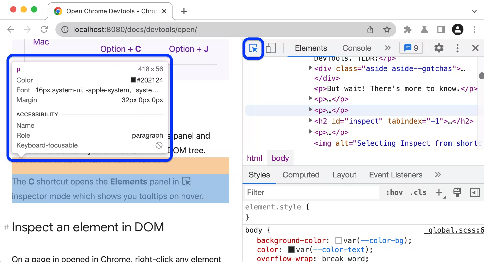 Developer Tools in Chrome showing the Elements panel
To find an element's selector:
- Click the element selector tool (cursor icon in the top-left of Developer Tools)
- Hover over and click the element you want to style
- Look at the element's classes, IDs, and tag name in the Elements panel
- Use these to build your CSS selector
CSS Variables (Theming System)
Definer uses CSS variables (also called custom properties) to handle colors and spacing. These variables aren't static. You can edit them in the Theme Editor.
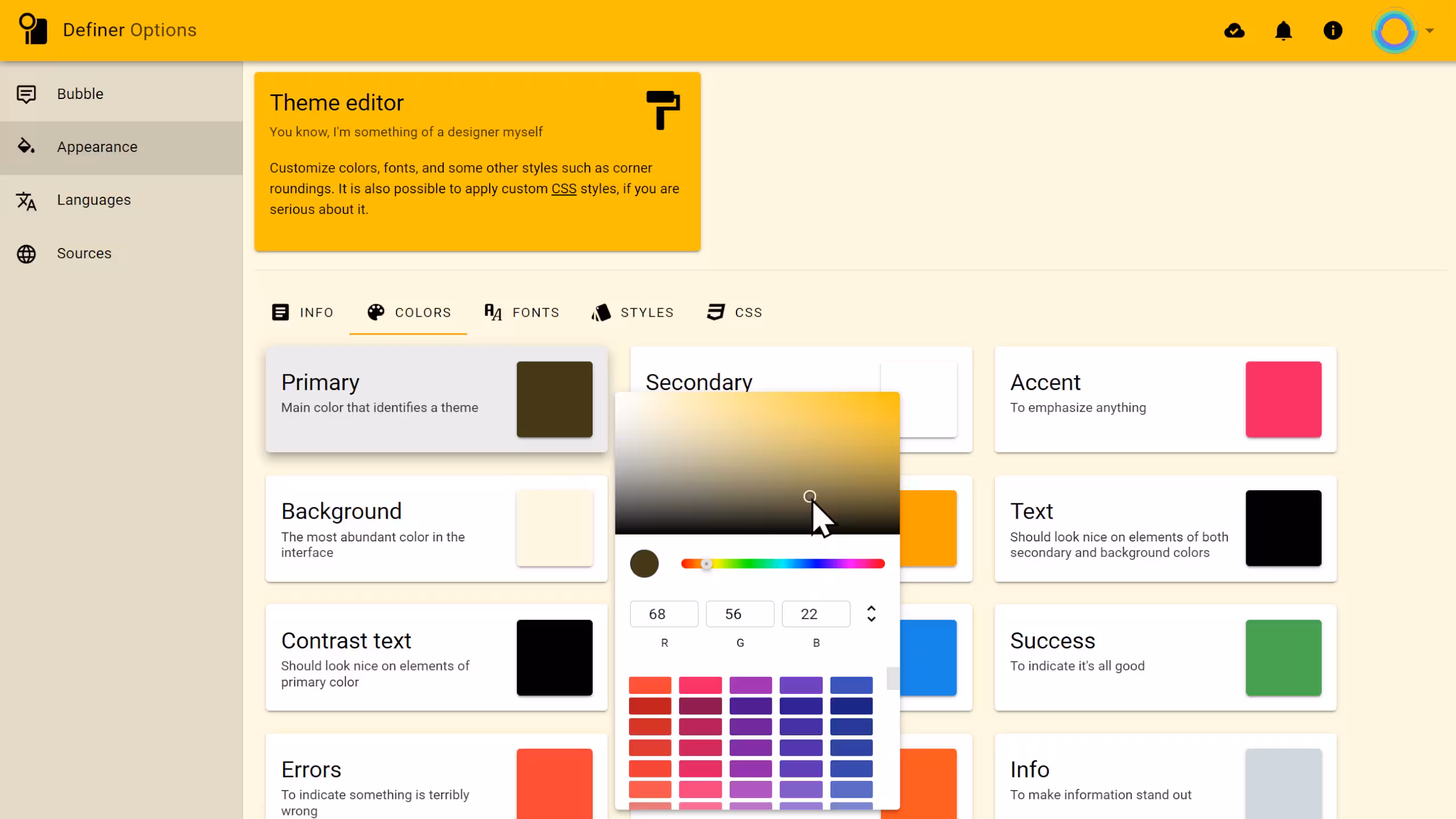 Definer's theme editor - Colors tab
Here's an example of how to use CSS variables in your styles:
{
  /* Use the base text color */
  color: var(--v-text-base);

  /* Use the primary background color */
  background-color: var(--v-primary-base);

  /* Use a subtle border color */
  border: 1px solid var(--v-border-base);
}
Why use CSS variables?
If you hard-code a color like #000000, it stays black even if you switch themes. If you use a variable like var(--v-text-base), the color automatically updates to match your active theme.
Below are the variables you can use. The examples show values from the default Dark Theme, but remember that these values change based on your settings.
Background Colors
Use these for backgrounds of containers, cards, panels, and page areas.
| Variable | Purpose | Example Value |
|---|---|---|
--v-ground-base | Main page background | #343a40 |
--v-secondary-base | Cards, panels, less prominent areas | #455a64 |
--v-primary-base | Accent backgrounds (buttons, active tabs) | #a36600 |
--v-highlight-base | Subtle highlight (hover states, zebra rows) | rgba(255,255,255, 0.05) |
Click to see all available variants
/* Ground - for layered surfaces and depth */
--v-ground-lighten1: #4b5157;
--v-ground-lighten2: #636970;
--v-ground-lighten3: #7b8289;
--v-ground-lighten4: #959ca3;
--v-ground-lighten5: #b0b7be;
--v-ground-darken1: #1f242a;
--v-ground-darken2: #070f16;
--v-ground-darken3: #000000;
--v-ground-darken4: #000000;

/* Secondary - for cards and panels */
--v-secondary-lighten1: #5d737d;
--v-secondary-lighten2: #768c97;
--v-secondary-lighten3: #90a6b2;
--v-secondary-lighten4: #abc2cd;
--v-secondary-lighten5: #c6dde9;
--v-secondary-darken1: #2e434c;
--v-secondary-darken2: #182c35;
--v-secondary-darken3: #011820;
--v-secondary-darken4: #000009;

/* Primary - for accent backgrounds */
--v-primary-lighten1: #c17f23;
--v-primary-lighten2: #df993e;
--v-primary-lighten3: #feb458;
--v-primary-lighten4: #ffcf72;
--v-primary-lighten5: #ffec8d;
--v-primary-darken1: #864e00;
--v-primary-darken2: #6a3700;
--v-primary-darken3: #512000;
--v-primary-darken4: #3d0900;
What are lighten/darken variants?
Variants are generated automatically by lightening or darkening the base color. They help you create depth and hierarchy by using slightly different shades of the same color.
Text Colors
Use these for text content to ensure proper contrast and readability.
| Variable | Purpose | Example Value |
|---|---|---|
--v-text-base | Main body text | #ffffff |
--v-ptext-base | Emphasized text (headings, keywords) | #ffa000 |
--v-contrast-base | Text on primary-colored backgrounds | #ffffff |
--v-anchor-base | Links | #a6d7ff |
Click to see all available variants
/* Text - main body text */
--v-text-lighten1: #ffffff;
--v-text-lighten2: #ffffff;
--v-text-lighten3: #ffffff;
--v-text-lighten4: #ffffff;
--v-text-lighten5: #ffffff;
--v-text-darken1: #e2e2e2;
--v-text-darken2: #c6c6c6;
--v-text-darken3: #ababab;
--v-text-darken4: #919191;

/* Primary Text - for emphasis */
--v-ptext-lighten1: #ffbb30;
--v-ptext-lighten2: #ffd74e;
--v-ptext-lighten3: #fff36b;
--v-ptext-lighten4: #ffff87;
--v-ptext-lighten5: #ffffa4;
--v-ptext-darken1: #df8600;
--v-ptext-darken2: #c06c00;
--v-ptext-darken3: #a15400;
--v-ptext-darken4: #843c00;

/* Contrast - text on primary backgrounds */
--v-contrast-lighten1: #ffffff;
--v-contrast-lighten2: #ffffff;
--v-contrast-lighten3: #ffffff;
--v-contrast-lighten4: #ffffff;
--v-contrast-lighten5: #ffffff;
--v-contrast-darken1: #e2e2e2;
--v-contrast-darken2: #c6c6c6;
--v-contrast-darken3: #ababab;
--v-contrast-darken4: #919191;

/* Anchor - links */
--v-anchor-lighten1: #c2f3ff;
--v-anchor-lighten2: #dfffff;
--v-anchor-lighten3: #fcffff;
--v-anchor-lighten4: #ffffff;
--v-anchor-lighten5: #ffffff;
--v-anchor-darken1: #8abbe2;
--v-anchor-darken2: #6fa0c6;
--v-anchor-darken3: #5486ab;
--v-anchor-darken4: #386d90;
Status Colors
Use these to indicate success, errors, warnings, or informational content.
| Variable | Purpose | Example Value |
|---|---|---|
--v-success-base | Success states, positive indicators | #4caf50 |
--v-error-base | Errors, destructive actions | #f44336 |
--v-warning-base | Warnings, caution states | #ff5722 |
--v-info-base | Informational content | #546e7a |
Click to see all available variants
/* Success */
--v-success-lighten1: #69cb69;
--v-success-lighten2: #85e783;
--v-success-lighten3: #a2ff9e;
--v-success-lighten4: #beffba;
--v-success-lighten5: #dcffd6;
--v-success-darken1: #2d9437;
--v-success-darken2: #00791e;
--v-success-darken3: #006000;
--v-success-darken4: #004700;

/* Error */
--v-error-lighten1: #ff614e;
--v-error-lighten2: #ff7e66;
--v-error-lighten3: #ff9b80;
--v-error-lighten4: #ffb89a;
--v-error-lighten5: #ffd6b5;
--v-error-darken1: #d31f1f;
--v-error-darken2: #b30008;
--v-error-darken3: #940000;
--v-error-darken4: #760000;

/* Warning */
--v-warning-lighten1: #ff743c;
--v-warning-lighten2: #ff9055;
--v-warning-lighten3: #ffac6f;
--v-warning-lighten4: #ffc98a;
--v-warning-lighten5: #ffe7a5;
--v-warning-darken1: #de3902;
--v-warning-darken2: #bd1300;
--v-warning-darken3: #9e0000;
--v-warning-darken4: #800000;

/* Info */
--v-info-lighten1: #6d8794;
--v-info-lighten2: #87a2ae;
--v-info-lighten3: #a1bdca;
--v-info-lighten4: #bcd8e6;
--v-info-lighten5: #d8f5ff;
--v-info-darken1: #3c5661;
--v-info-darken2: #253e49;
--v-info-darken3: #0d2933;
--v-info-darken4: #00141e;
Accent Color
A supplementary accent color for additional visual variety.
| Variable | Purpose | Example Value |
|---|---|---|
--v-accent-base | Secondary accent color | #fff8e1 |
Click to see all available variants
--v-accent-lighten1: #fffffe;
--v-accent-lighten2: #ffffff;
--v-accent-lighten3: #ffffff;
--v-accent-lighten4: #ffffff;
--v-accent-lighten5: #ffffff;
--v-accent-darken1: #e2dbc5;
--v-accent-darken2: #c6c0aa;
--v-accent-darken3: #aba58f;
--v-accent-darken4: #908a76;
Borders
Use these for consistent border styling across elements.
| Variable | Purpose | Example Value |
|---|---|---|
--v-border-base | Standard, subtle borders | rgba(255,255,255, 0.12) |
--v-border-darken1 | More visible borders | rgba(255,255,255, 0.25) |
--v-border-darken2 | High contrast borders | rgba(255,255,255, 0.4) |
Example usage:
{
  /* Subtle divider */
  border-bottom: 1px solid var(--v-border-base);

  /* Prominent border */
  border: 2px solid var(--v-border-darken1);

  /* High contrast outline */
  outline: 1px solid var(--v-border-darken2);
}
RGB Values
These provide raw RGB values for use with rgba() when you need custom opacity.
| Variable | Purpose | Example Value |
|---|---|---|
--primary-rgb | Primary color as RGB | 163, 102, 0 |
--secondary-rgb | Secondary color as RGB | 69, 90, 100 |
--accent-rgb | Accent color as RGB | 255, 248, 225 |
--error-rgb | Error color as RGB | 244, 67, 54 |
--warning-rgb | Warning color as RGB | 255, 87, 34 |
--info-rgb | Info color as RGB | 84, 110, 122 |
--success-rgb | Success color as RGB | 76, 175, 80 |
--ground-rgb | Ground color as RGB | 52, 58, 64 |
--text-rgb | Text color as RGB | 255, 255, 255 |
--ptext-rgb | Primary text color as RGB | 255, 160, 0 |
--contrast-rgb | Contrast text color as RGB | 255, 255, 255 |
--anchor-rgb | Anchor color as RGB | 166, 215, 255 |
Example usage:
{
  /* Slightly dimmed text (70% opacity) */
  color: rgba(var(--text-rgb), 0.7);

  /* Semi-transparent primary background */
  background-color: rgba(var(--primary-rgb), 0.5);

  /* Subtle status background tints */
  background: rgba(var(--success-rgb), 0.15);
  background: rgba(var(--error-rgb), 0.15);

  /* Overlay with ground color */
  background: rgba(var(--ground-rgb), 0.9);

  /* Subtle link underline */
  border-bottom: 1px solid rgba(var(--anchor-rgb), 0.5);
}
Typography & Layout
| Variable | Purpose | Example Value |
|---|---|---|
--font-family | Font stack | "Roboto", sans-serif |
--font-size | Base font size | 16px |
--font-weight | Default font weight | normal |
--border-radius | Corner rounding (all corners) | 4px |
--border-radius-left-top | Top-left corner only | 4px |
--border-radius-right-top | Top-right corner only | 4px |
--border-radius-right-bottom | Bottom-right corner only | 4px |
--border-radius-left-bottom | Bottom-left corner only | 4px |
Example usage:
{
  /* Match Definer's typography */
  font-family: var(--font-family);
  font-size: var(--font-size);

  /* Rounded corners */
  border-radius: var(--border-radius);

  /* Custom corner rounding (e.g., tabs) */
  border-radius: var(--border-radius-left-top) var(--border-radius-right-top) 0 0;
}
CSS Cheatsheet
This cheatsheet contains ready-to-use CSS snippets for styling third-party websites inside Definer's popup. Since popup space is limited, these focus on removing clutter, improving readability, and matching Definer's look.
The !important Rule
Third-party websites have their own CSS that often overrides your styles. Add !important to ensure your styles take priority:
color: var(--v-text-base) !important;Almost every property in source CSS needs !important to work reliably.
Hiding Unwanted Elements
Remove ads, headers, footers, cookie banners, and other clutter to save space.
/* Common elements to hide */
header,
footer,
nav,
.ad,
.cookie-banner,
.popup,
.modal,
.sidebar {
  display: none !important;
}/* Target multiple specific selectors */
#header,
#footer,
.advertisement,
[class*='cookie'],
[id*='consent'] {
display: none !important;
}Base Page Styling
Set up the foundation that matches Definer's theme.
/* Reset background and text colors */
html,
body {
  background: var(--v-ground-base) !important;
  color: var(--v-text-base) !important;
}

/* Style all links */
a {
  color: var(--v-anchor-base) !important;
}
Text Hierarchy
Create visual hierarchy with different text treatments.
/* Regular text */
p,
li,
td {
  color: var(--v-text-base) !important;
}

/* Headings - use emphasized text color */
h1,
h2,
h3,
h4 {
  color: var(--v-ptext-base) !important;
}

/* Secondary/muted text */
.caption,
.meta,
.subtitle,
small {
  color: rgba(var(--text-rgb), 0.7) !important;
}

/* Dimmed text */
.hint,
.note {
  color: var(--v-text-darken2) !important;
}
Container Backgrounds
Layer different background colors for depth.
/* Main content area */
.content {
  background: var(--v-ground-base) !important;
}

/* Cards or panels */
.card,
.panel,
.box {
  background: var(--v-secondary-base) !important;
  color: var(--v-text-base) !important;
}

/* Subtle highlight areas */
.highlight,
blockquote {
  background: var(--v-highlight-base) !important;
}

/* Semi-transparent overlay */
.overlay {
  background: rgba(var(--ground-rgb), 0.9) !important;
}
Buttons and Interactive Elements
Style buttons and clickable elements to match Definer.
/* Primary buttons */
button,
.btn,
.button {
  background: var(--v-primary-base) !important;
  color: var(--v-contrast-base) !important;
  border: none !important;
  border-radius: var(--border-radius) !important;
}

/* Secondary/outline buttons */
.btn-secondary {
  background: var(--v-secondary-base) !important;
  color: var(--v-text-base) !important;
  border: 1px solid var(--v-border-base) !important;
}

/* Hover states */
button:hover,
.btn:hover {
  background: var(--v-primary-lighten1) !important;
}
Tabs and Navigation
Style tab interfaces commonly found on dictionary sites.
/* Tab container */
.tabs,
.tab-list {
  background: var(--v-secondary-base) !important;
  border: none !important;
}

/* Inactive tabs */
.tab,
.tab-item {
  background: var(--v-secondary-base) !important;
  color: var(--v-text-base) !important;
  border: 1px solid var(--v-border-base) !important;
}

/* Active tab */
.tab.active,
.tab-item.active {
  background: var(--v-primary-base) !important;
  color: var(--v-contrast-base) !important;
}
Tables
Style data tables for better readability.
/* Table base */
table {
  background: var(--v-ground-base) !important;
  border-collapse: collapse !important;
  width: 100% !important;
}

/* Header cells */
th {
  background: var(--v-secondary-base) !important;
  color: var(--v-text-base) !important;
}

/* Body cells */
td {
  color: var(--v-text-base) !important;
  border-color: var(--v-border-base) !important;
}

/* Zebra striping */
tr:nth-child(even) {
  background: rgba(var(--text-rgb), 0.03) !important;
}

tr:nth-child(odd) {
  background: rgba(var(--text-rgb), 0.06) !important;
}

/* Hover effect */
tr:hover {
  background: rgba(var(--text-rgb), 0.1) !important;
}
Borders
Apply consistent border styling.
/* Subtle borders */
.element {
  border: 1px solid var(--v-border-base) !important;
}

/* More visible borders */
.element-prominent {
  border: 1px solid var(--v-border-darken1) !important;
}

/* Accent borders */
.element-accent {
  border-color: var(--v-primary-base) !important;
}

/* Remove borders entirely */
.clean {
  border: none !important;
}
Status Indicators
Use semantic colors for different states.
/* Success */
.success,
.correct,
.positive {
  color: var(--v-success-base) !important;
}

.success-bg {
  background: rgba(var(--success-rgb), 0.3) !important;
}

/* Error */
.error,
.wrong,
.negative {
  color: var(--v-error-base) !important;
}

.error-bg {
  background: rgba(var(--error-rgb), 0.3) !important;
}

/* Warning */
.warning,
.caution {
  color: var(--v-warning-base) !important;
}
SVG Icons
Style inline SVG icons to match text.
svg {
  fill: var(--v-text-base) !important;
}

/* Muted icons */
svg.icon-muted {
  fill: rgba(var(--text-rgb), 0.7) !important;
}

/* Accent icons */
svg.icon-accent {
  fill: var(--v-primary-base) !important;
}
Scrollbars
Customize scrollbar appearance (works in Firefox and Chrome).
html {
  scrollbar-color: var(--v-secondary-darken1) var(--v-secondary-base);
  scrollbar-width: thin;
}
Layout Fixes
Adjust spacing and sizing for optimal popup display.
/* Remove excess padding/margins */
body,
.container,
.wrapper {
  padding: 0 !important;
  margin: 0 !important;
}

/* Full width content */
.content,
main,
article {
  width: 100% !important;
  max-width: 100% !important;
}

/* Remove shadows */
.card,
.panel {
  box-shadow: none !important;
}

/* Compact spacing */
.element {
  padding: 0.5em !important;
  margin: 0.25em 0 !important;
}
Responsive Adjustments
Handle different popup sizes.
/* Narrow popup adjustments */
@media (max-width: 400px) {
  .hide-on-small {
    display: none !important;
  }

  /* Stack horizontal layouts */
  .row {
    flex-direction: column !important;
  }
}

/* Medium popup */
@media (max-width: 600px) {
  .sidebar {
    display: none !important;
  }
}
Complete Template
Here's a starting template you can customize for most websites:
/* === HIDE UNWANTED ELEMENTS === */
header,
footer,
nav,
.ad,
.sidebar,
.cookie-banner,
[class*='advertisement'] {
  display: none !important;
}

/* === BASE STYLING === */
html,
body {
  background: var(--v-ground-base) !important;
  color: var(--v-text-base) !important;
}

a {
  color: var(--v-anchor-base) !important;
}

/* === TEXT === */
h1,
h2,
h3,
h4 {
  color: var(--v-ptext-base) !important;
}

/* === CONTAINERS === */
.card,
.panel,
.box {
  background: var(--v-secondary-base) !important;
  color: var(--v-text-base) !important;
  border: 1px solid var(--v-border-base) !important;
}

/* === BUTTONS === */
button,
.btn {
  background: var(--v-primary-base) !important;
  color: var(--v-contrast-base) !important;
  border: none !important;
  border-radius: var(--border-radius) !important;
}

/* === LAYOUT === */
body {
  padding: 0 !important;
  margin: 0 !important;
}

/* === SCROLLBAR === */
html {
  scrollbar-color: var(--v-secondary-darken1) var(--v-secondary-base);
  scrollbar-width: thin;
}
Examples
For complete real-world examples of styling third-party websites, check out the Custom Source Examples page.